This was a self-initiated project, to design a new banking experience for Barclays customers. I solutionised a digital strategy accompanied by a POC, to address customer pain-points and opportunity costs by proposing a digital transformation that will rival challenger banks, grow customer retention and acquisition, and boost additional revenue. (Barclays if you see this, hit me up!)
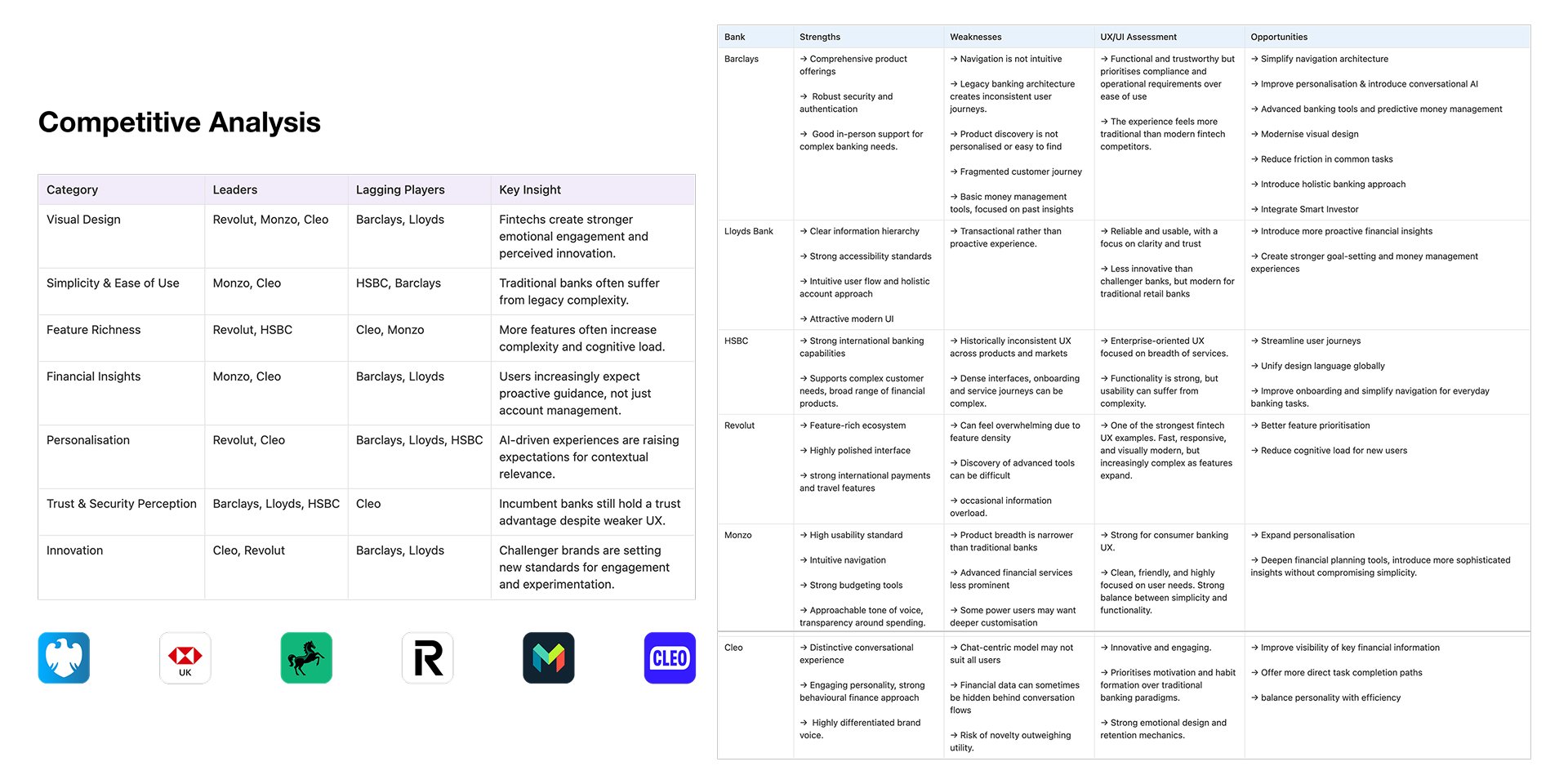
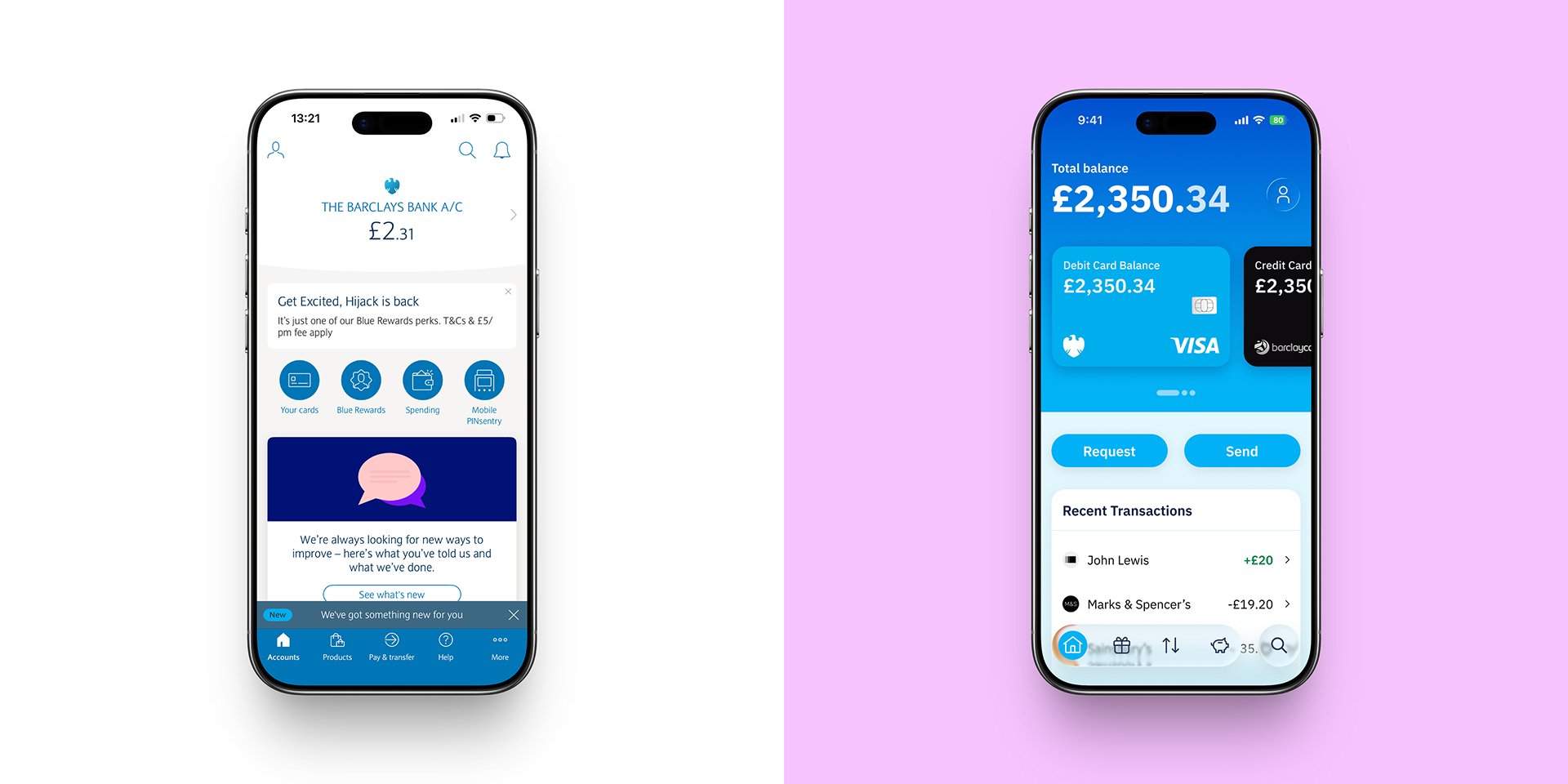
The Barclays app has not seen a design overhaul since 2015, over 10 years ago and customers are commenting: "A step behind modern banking apps". The challenge was to combine business needs with customer pain-points, to create a new digital strategy, digital brand direction, and user experience, to challenge digital first banks and attract a new generation of digitally native customers.
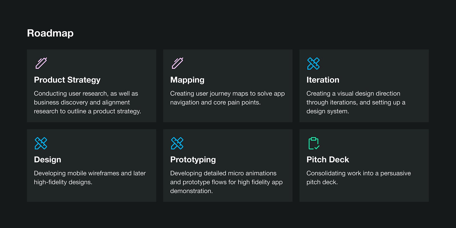
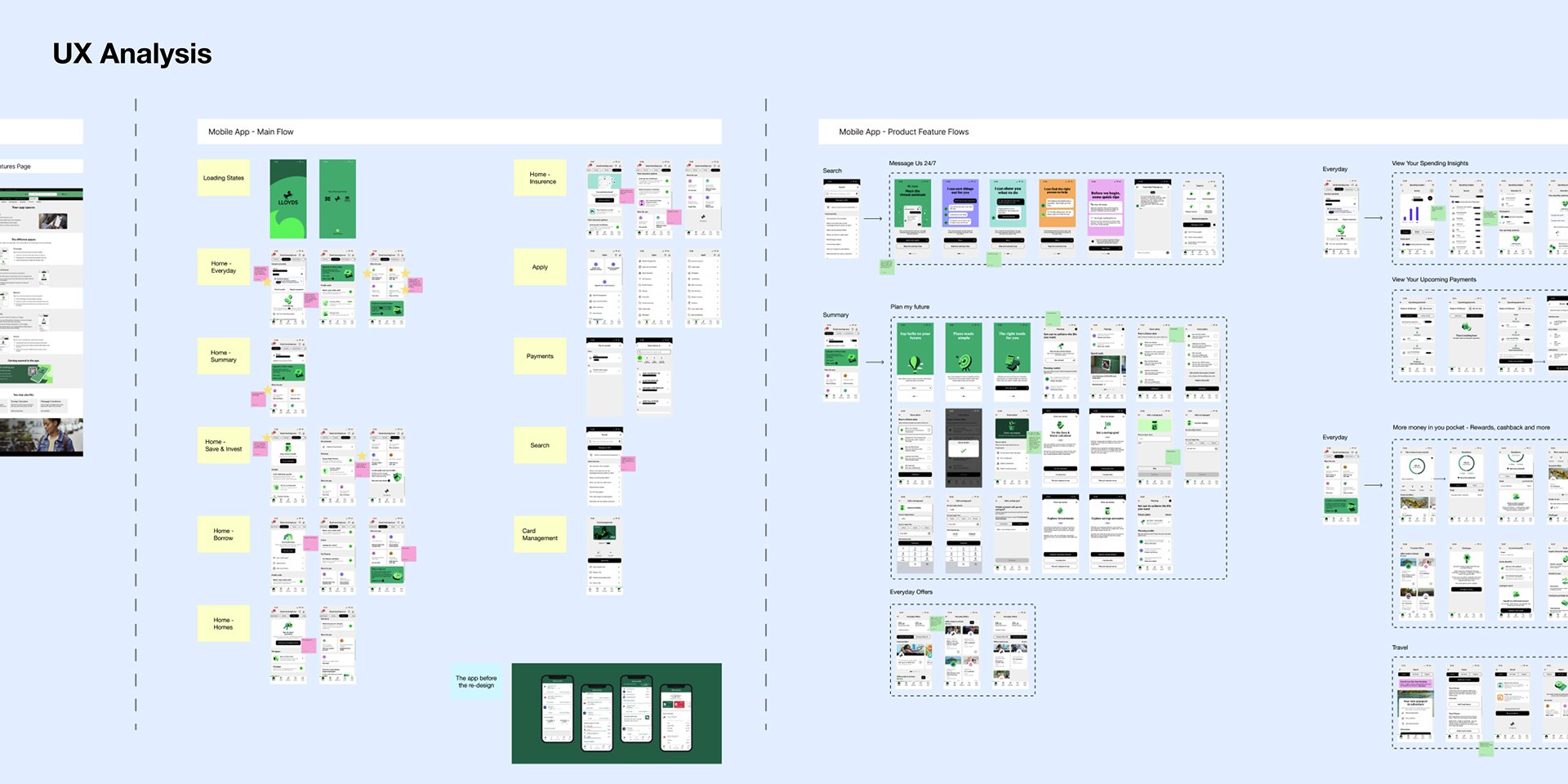
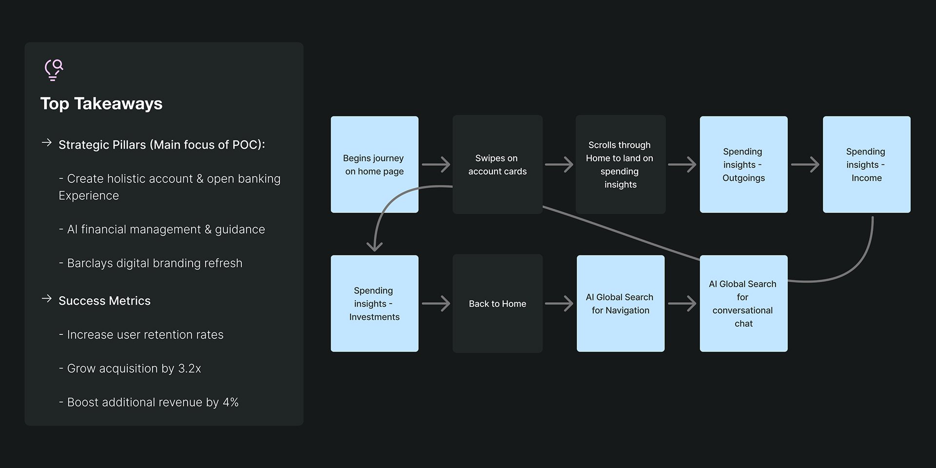
As the sole designer and product strategist for this project, the discovery phase was a big part of my process. Coming from a design mindset, I began by researching into the current Barclays app, how it behaves, the solutions it provides, and where it falls short. I researched into the customer's journey, their pain-points and what they where wanting to see in their banking app. Then I shifted to a strategic mindset and researched into Barclays' as a company, finding their business goals, their current market position, how other banks are out-performing and where opportunity lies for them. From this, I was able to merge my design expertise with strategical thinking to design product solutions.
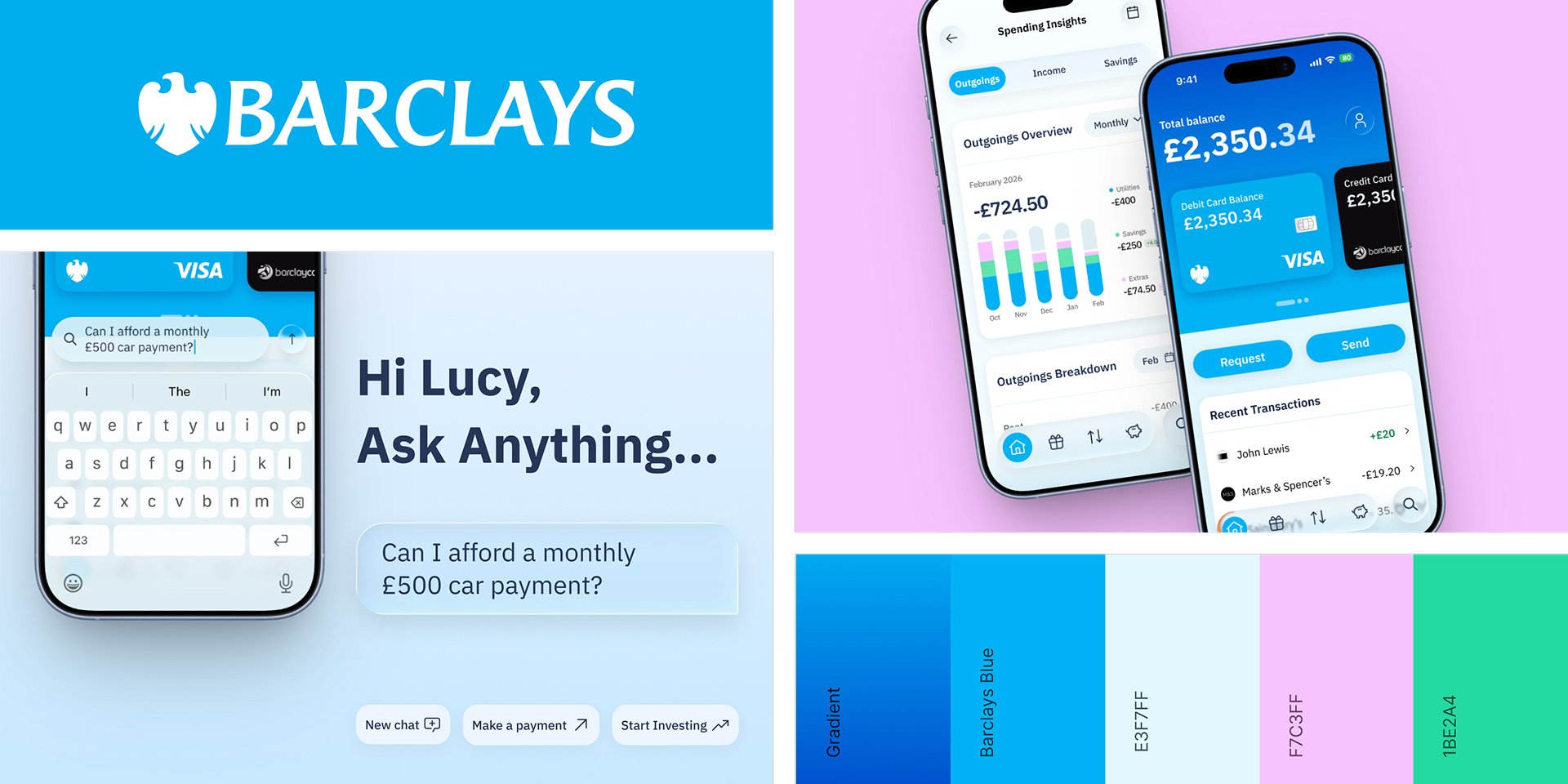
I began with wireframes to understand the content placement design and then moved onto higher-fidelity iteration, exploring ways to express Barclays' well-known branding in a refreshed UI setting. Apple recently launched their liquid glass UI across IOS, and so this was used for the functional app buttons and navigation system within the design, to comply with the update, as well as adding dimension and hierarchy to the screens. A significant factor to the design was also being compliant to WCAG standards, whilst balancing the use of Barclays' iconic blue. After many variations and WCAG testing, instead of using the branding blue as an accent, I chose to make it the main colour. My reasoning for this was wanting to really distinguish the UI from other banking apps, creating an identity that is recognised instantly. In addition, the blue is such a fun, fresh and vibrant colour. When it comes to financial management, everyday customers don't want to feel anxious when checking their accounts, and one way to psychologically minimise this impact is through design.
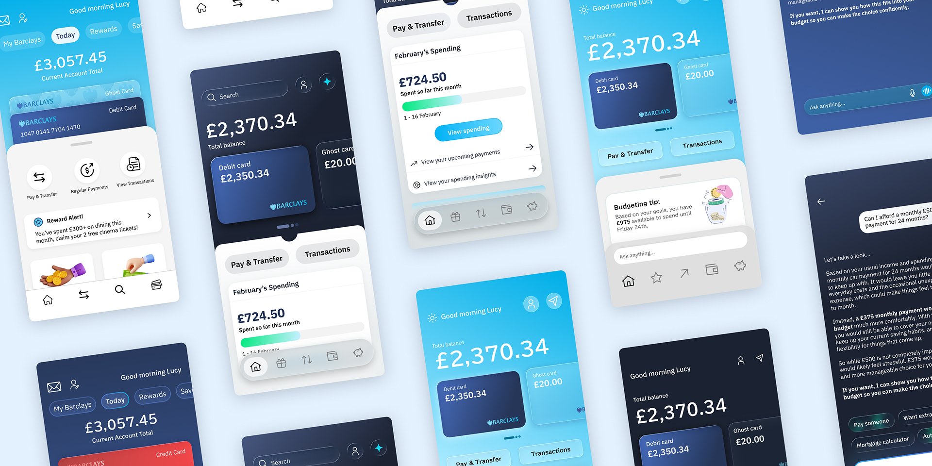
My vision for the new era of Barclays digital banking aggregates all customer accounts in one place, and so at the top of the home screen, the accounts are made easily accessible by swiping right and selecting the desired account card. The current Barclays home page experience is focused on generic financial product placement, and does not allow for quick access to key everyday metrics that customers want to see. That is why my vision simplifies the navigational experience by giving quick access to Recent Transactions, Spending Insights, Upcoming Payments, Rewards and personalised product offerings, so customers don't have to go searching. In addition, the main CTAs are Request and Send. This was deliberate. Did you know, every year in the UK we loose out on almost £3 billion due to friends and family forgetting to pay us back? It can be awkward to have to ask, so instead I have added this button so customers can send a friendly reminder! And this is great for Barclays too, because it will increase transaction volume!
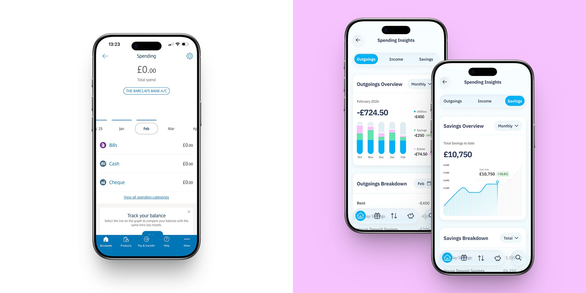
My vision for Spending Insights gives a breakdown of Income, Outgoings and Savings / Investments. It is the ultimate money tracker. Customers have stated with the current app experience, that they would find it easier tracking their money manually or going to a third party app to do it for them, but with this update there is no need to leave the app. My proposal also includes a plan to scale this feature to incorporate goal tracking and saving pots.
Not only does this feature help customers to navigate the app seamlessly, but it also acts as a personal wealth advisor and money management guru. This feature sits in the global navigation as a separated CTA so the customer can access it at any point in the app. Customer's can search anything from "I forgot my pin number" to "Can I afford a monthly £500 car payment". The aim is to decrease customer service costs for Barclays, and to increase financial confidence and assurance in customers, helping them with whatever financial question, query, situation or goals they have 24/7.
I consolidated my project into a pitch deck and presented the concept to my company's director and senior strategy team members, pitching this as a business opportunity to gain a new client account. My design concept received a lot of interest and they were keen to put this in-front of Barclays to show our capabilities.